Killing Me Softly
- Jon O'Hair

- Nov 5, 2018
- 1 min read
Updated: Nov 7, 2018
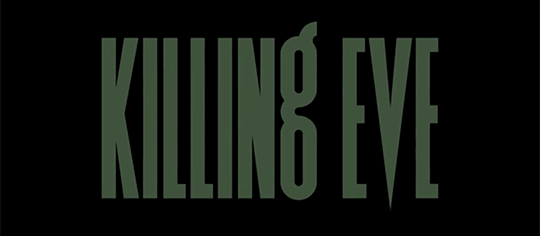
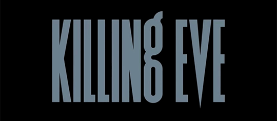
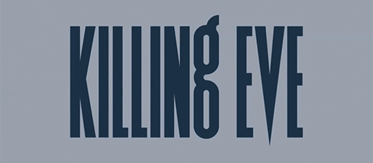
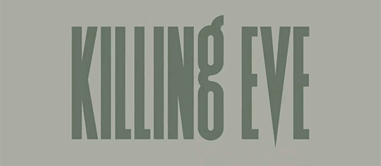
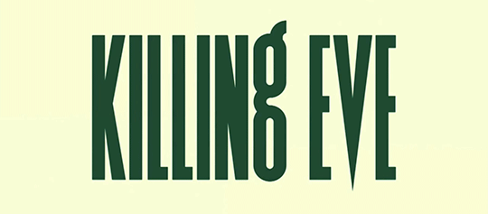
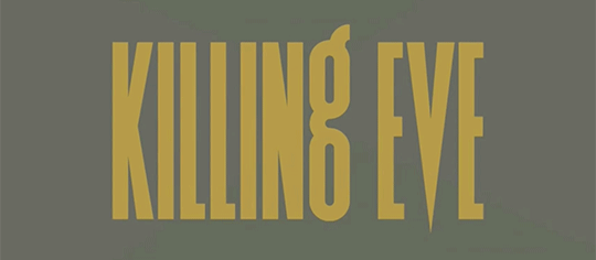
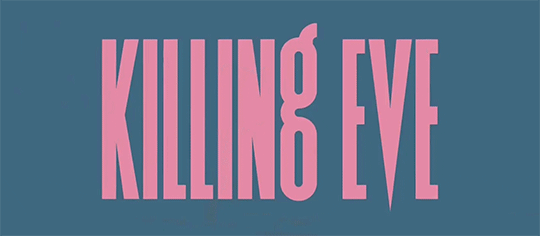
Not only has this been one of my favourite TV shows of 2018 with Phoebe Waller-Bridge's "sharp as a tack" writing and viciously dark humour, but there's been something captivating about the oversized title cards used throughout the series. UK based designer Matt Willey created the bespoke typeface which has definite nods to Knockout Flyweight.
For the title cards, not only do the colour combinations change each episode, but there is also an animated blood drip which alternates between appearing on the "K", "N" and "E"...

And for the location cards, there is a sympathetic correlation between the colouring of the background image and the colour used for the type itself...

You have to admire the thought and attention to detail here.


Comments